Sales & Shipping Dashboard

Sales & Shipping Dashboard is designed to provide a comprehensive view of sales and shipping data with an emphasis on different filters, key metrics, and graphical representations.

About Project

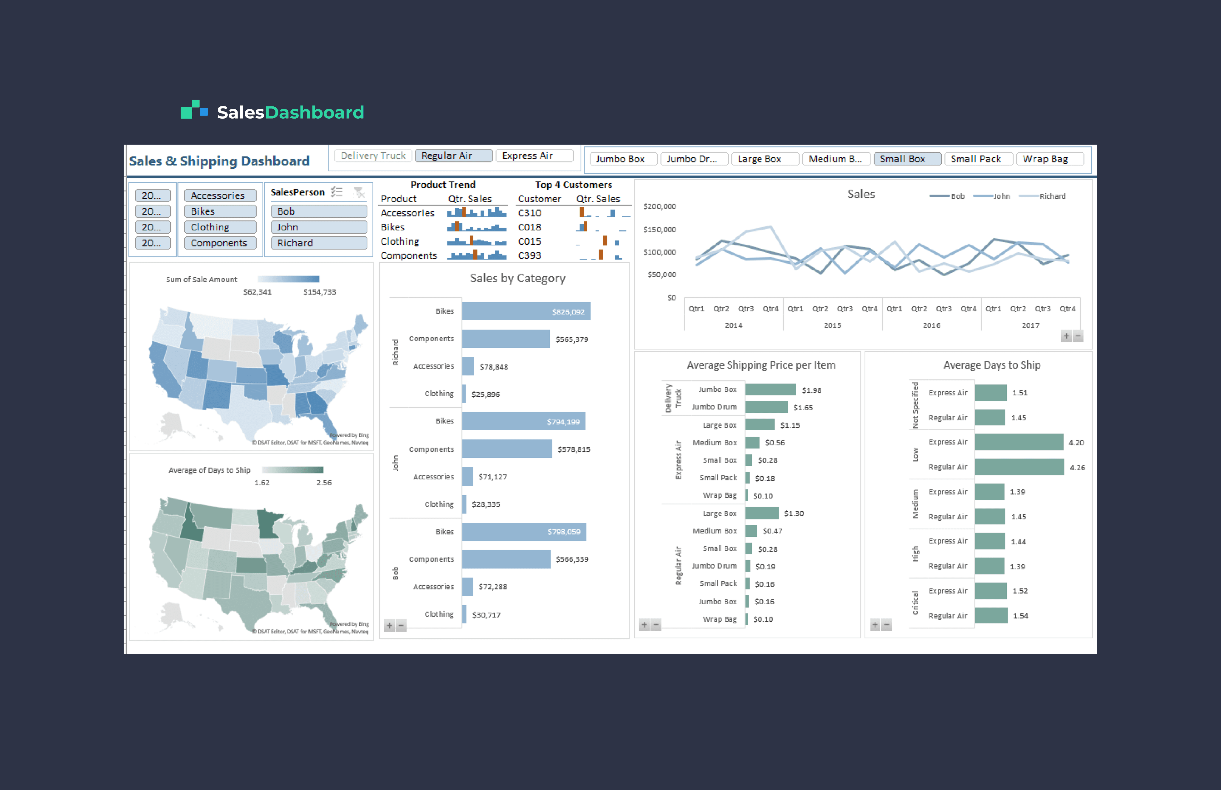
Dashboard covers data from the years 2014 to 2018 and provides filters for accessories, bikes, clothing, and components. It also allows filtering by salesperson and priority levels for shipping. The dashboard highlights several important metrics related to sales, shipping, and customer data.

The dashboard comprises several key components:

  1. Filters: Users can filter data by year, product categories (Accessories, Bikes, Clothing, Components), salesperson, and shipping priority levels (e.g., Express Air, Regular Air, Delivery Truck).

  2. Average Shipping Price per Item: This section displays the average shipping price per item for different shipping methods and package sizes.

  3. Top 4 Customers and Quarter Sales: Here, users can view the top four customers and their quarterly sales for each product category.

  4. Sales by Category for Top SalesPerson: This section provides a bar graph illustrating sales by category for the top-performing salesperson.

  5. Average Shipping Price per Item (Delivery Truck, Regular Air, Express Air): Users can see the average shipping prices for specific shipping methods (e.g., Delivery Truck, Regular Air, Express Air).

  6. Average Day to Ship: A chart displays the average number of days required to ship orders based on priority levels (Critical, High, Medium, Low).

The dashboard spans 2014-2018, featuring filters for products, salespeople, and shipping priorities, showcasing essential metrics in sales, shipping, and customer data.

Waqas Ahmad – Data Analyst

Let's collaborate and bring your vision to life!

©2023 Designed by Waqas Ahmad

Going up?

Let's collaborate and bring your vision to life!

©2023 Designed by Waqas Ahmad

Going up?